[EXAMPLES] /examples?view=breakdowns
What I look at
Real sites, the design systems behind the best of them, breakdowns from the people who made them, and the way I read all of it.
Showing Breakdowns
Great sites taken apart, using their makers’ own write-ups. Each one says what they decided, how they built it, and what I take from it.
Case studies
- [01] bruno-simon-folio
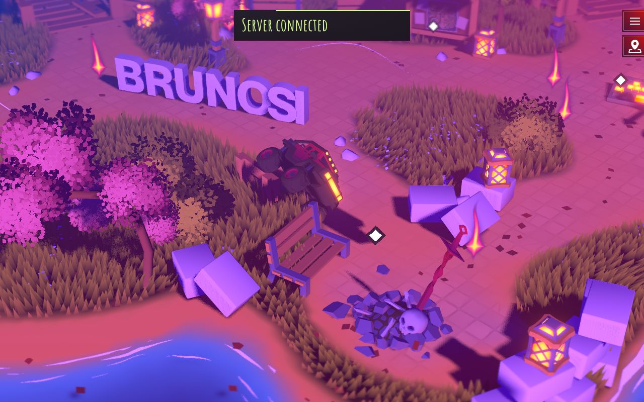
Bruno Simon: a portfolio you drive
Two open-source three.js portfolios where you steer a small vehicle around a world, from the 2019 cannon.js original to the 2025 WebGPU rebuild.
read the breakdown → - [02] emil-sonner
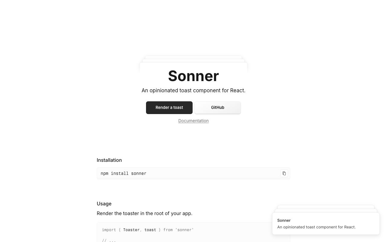
Sonner: how a toast earns its polish
Emil Kowalski's own breakdown of the details behind Sonner, the React toast library, from stacking maths to swipe velocity and interruptible motion.
read the breakdown → - [03] github-globe
GitHub globe: live data as a WebGL scene
How GitHub drew a globe of real pull requests from about 12,000 instanced dots, hid its own performance shortcuts inside the design, and degraded gracefully on slow devices.
read the breakdown → - [04] igloo-inc
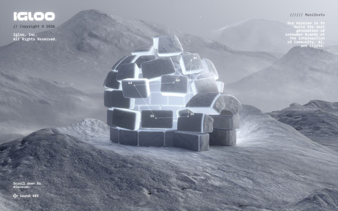
Igloo Inc.: a company site carved out of ice
How abeto built the Awwwards Site of the Year with procedural ice, compressed volume data and a WebGL interface, all in three.js.
read the breakdown → - [05] josh-comeau
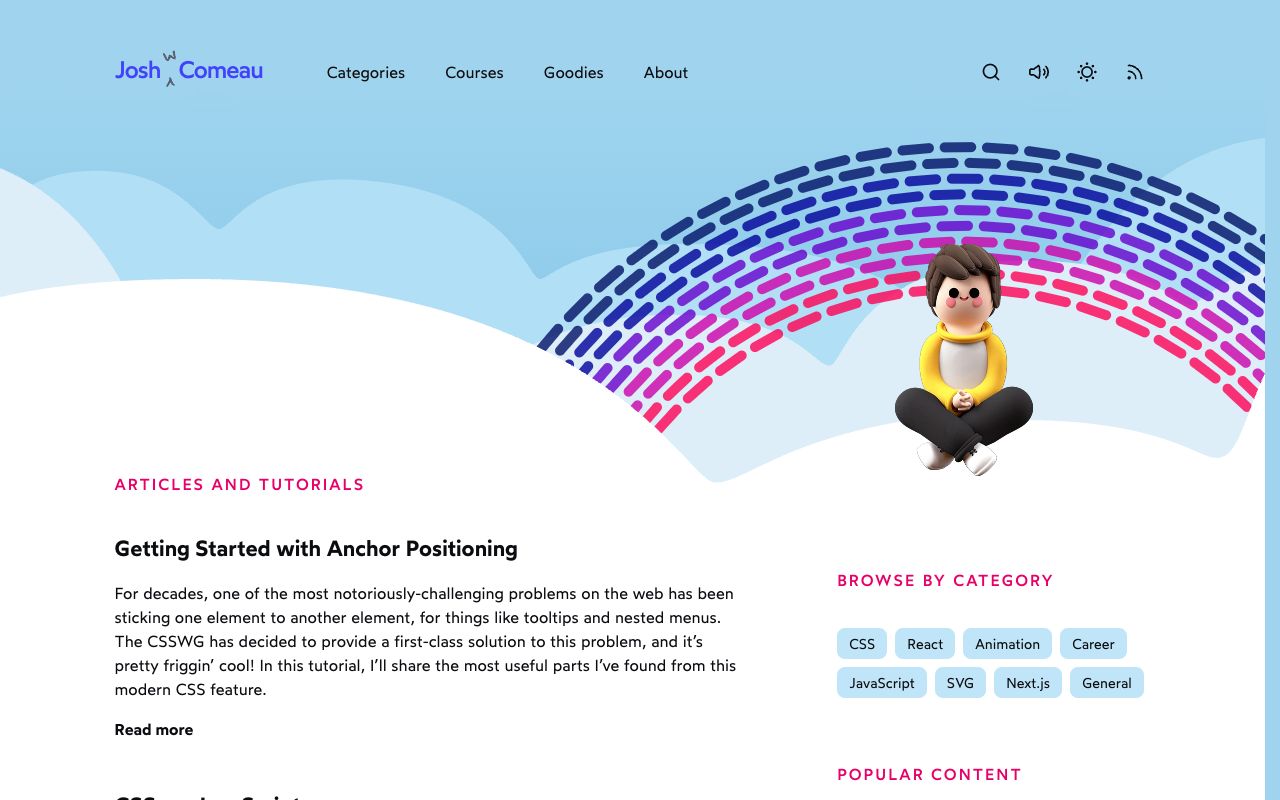
Josh W. Comeau: whimsy, explained by its maker
How Josh Comeau builds the playful details on his blog, from randomised sparkles to a rainbow button powered by registered custom properties.
read the breakdown → - [06] linear-redesign

Linear: redesigning a dense dark UI
How Linear cut visual noise, rebuilt its themes in LCH from three inputs, and shipped a full UI redesign in about six weeks, from its own write-up.
read the breakdown → - [07] stripe-connect
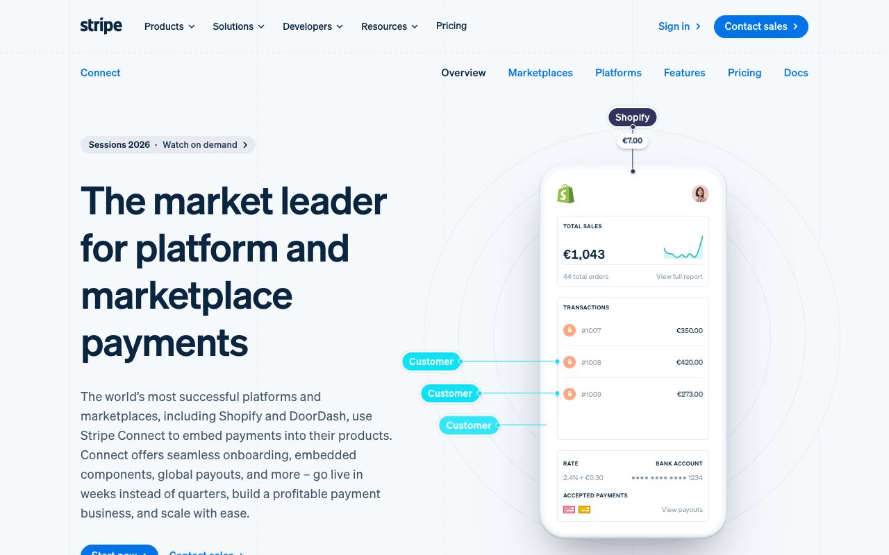
Stripe Connect: motion that stays fast
Stripe's own write-up of its Connect page, with CSS Grid stripes, CSS 3D cubes, a 5KB Web Animations demo and polyfills only for those who need them, plus how its animated mesh gradient works.
read the breakdown → - [08] vercel-3d-badge
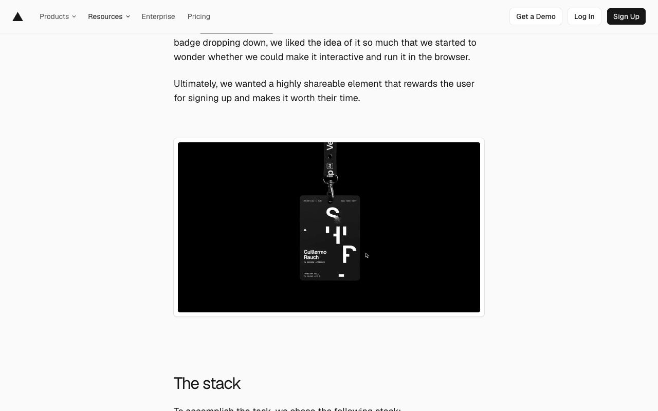
Vercel Ship badge: a lanyard you can grab
How Vercel turned a conference ticket into a 3D badge on a physics rope, in about 80 lines of React Three Fiber.
read the breakdown →