[§] /docs/cases/emil-sonner
Sonner: how a toast earns its polish
Emil Kowalski's own breakdown of the details behind Sonner, the React toast library, from stacking maths to swipe velocity and interruptible motion.
TL;DR
- Sonner looks simple. The polish is in small, deliberate choices: stacking, swiping, timing and hover behaviour.
- Its motion uses CSS transitions, not keyframes, so a toast can change course mid-animation.
- Dismissal is based on swipe speed, not only distance, and timers pause when you hover or leave the tab.
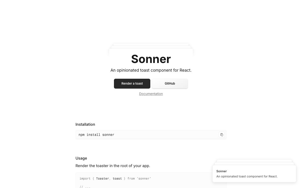
What it is
Sonner is an opinionated toast component for React by Emil Kowalski, a design engineer who previously worked on the design team at Vercel and now works on the web team at Linear. His site, emilkowal.ski, is almost all text, and his writing explains the thinking behind components like this one. In "Building a toast component" he walks through how Sonner works, and in "Great animations" he sets out the principles behind it.
How it's built
Stacking
Each toast is position: absolute. Its place in the stack comes from its index:
- The vertical offset is the gap multiplied by the index.
- The scale drops by
0.05 * index.
So the front toast sits at translateY(0) scale(1), the next at translateY(-14px) scale(0.95) and
the next at translateY(-28px) scale(0.9). When toasts have different heights, the stacked ones all
take the front toast's height, so the spacing stays even.
Motion
Toasts enter from translateY(100%) to translateY(0). A useEffect sets a mounted flag after the
first render, which triggers the change.
Emil started with CSS keyframes, then switched to transition: transform 400ms ease. With keyframes,
you can't smoothly change the end position while the animation is running, so older toasts jumped
into place when a new one arrived. Transitions are interruptible: they retarget from wherever they
are.
  new toast arrives while others are still moving

  keyframes:   A ──────▶ (finishes)  ──JUMP──▶ new spot
  transition:  A ──────▶ ╮
                         ╰──────▶ new spot   (retargets from current position)

  swipe:  pointerdown ──▶ capture pointer ──▶ track distance + time
                                               │
            |distance| >= threshold  OR  velocity > 0.11 ?
                    yes ──▶ dismiss            no ──▶ back in place
          dragging the wrong way ──▶ friction (slows, then stops)
Swiping
- Velocity, not just distance. Velocity is the absolute swipe distance divided by the time it
took. If it is above
0.11, the toast goes, so a quick flick is enough. - Pointer capture. Once a drag starts, the toast captures all pointer events, so it keeps following even if your pointer leaves it.
- Friction. Dragging in the direction that doesn't dismiss still moves the toast, but it slows down and eventually stops, rather than refusing to move.
Timing
Toasts leave after 4 seconds by default. The timer pauses while you hover the stack, and a
useIsDocumentHidden hook reads document.hidden so toasts don't disappear while you are in
another tab.
Hover
When the stack expands on hover, there are gaps between toasts. An :after pseudo-element fills
those gaps, so moving the pointer between toasts doesn't collapse the stack.
Design decisions
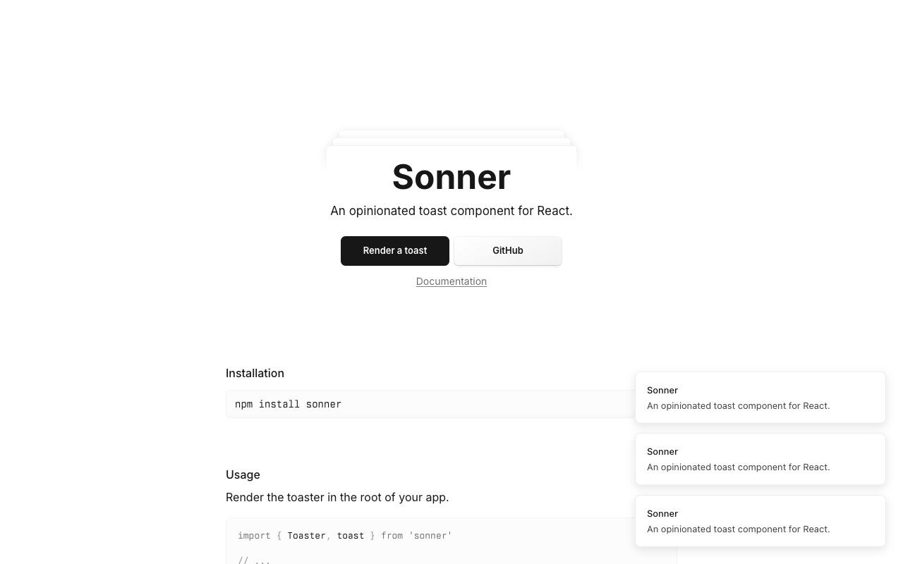
- Depth from scale, not shadow. In the stacked screenshot, the back toasts are slightly smaller and higher. That reads as a pile without heavy shadows or blur.
- Expand on intent. The stack only opens when you hover it. Most of the time it takes the space of one toast.
- Short and eased. "Great animations" says most UI motion should be under 300ms and use
ease-out, because it starts fast and feels responsive. It also says to animatetransformandopacity, which only need compositing. - Don't animate what people do constantly. He argues that keyboard-driven actions repeated many times a day, as in Raycast, feel right without animation.
- Respect the reader's settings. Motion should adapt under
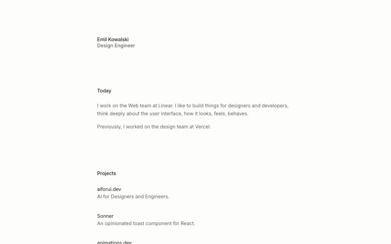
prefers-reduced-motion: reduce. - Quiet site, loud craft. Emil's own homepage is a plain list of text on an off-white page. The care goes into behaviour, not decoration.
Steal this
- Use transitions for anything that can be interrupted. Toasts, drawers and menus change their mind. Compare curves and durations in easing-lab, then pick an ease.
- Measure velocity for gestures. Distance alone makes swipes feel sticky. Divide by time and accept a quick flick.
- Set motion tokens once. A short duration and one ease-out curve, reused everywhere, gives a product one feel. See Motion tokens and Accessibility for the reduced-motion rule.
Sources
- Building a toast component, Emil Kowalski
- Great animations, Emil Kowalski
- Sonner
- emilkowal.ski
Bruno Simon: a portfolio you drive
Two open-source three.js portfolios where you steer a small vehicle around a world, from the 2019 cannon.js original to the 2025 WebGPU rebuild.
Josh W. Comeau: whimsy, explained by its maker
How Josh Comeau builds the playful details on his blog, from randomised sparkles to a rainbow button powered by registered custom properties.