[§] /docs/cases/stripe-connect
Stripe Connect: motion that stays fast
Stripe's own write-up of its Connect page, with CSS Grid stripes, CSS 3D cubes, a 5KB Web Animations demo and polyfills only for those who need them, plus how its animated mesh gradient works.
TL;DR
- Every effect on the Connect page picked the lightest tool that could do it: CSS Grid for the stripes, CSS 3D for cubes and devices, the Web Animations API for the product demo.
- Motion is choreographed with custom curves, only
transformandopacity, mostly under 500ms, and starts when it scrolls into view. - Decorative motion switches off under reduced motion. Stripe's animated gradient, in a later reverse-engineering, also pauses when it is off screen.
What it is
Connect is Stripe's product for platforms and marketplaces. In June 2017 Stripe relaunched its landing page, and Benjamin De Cock from Stripe's design team wrote up how it was built. The goal, in the post's words, was to reflect Connect's "intricate, cutting-edge capabilities while keeping things light and simple on the surface".
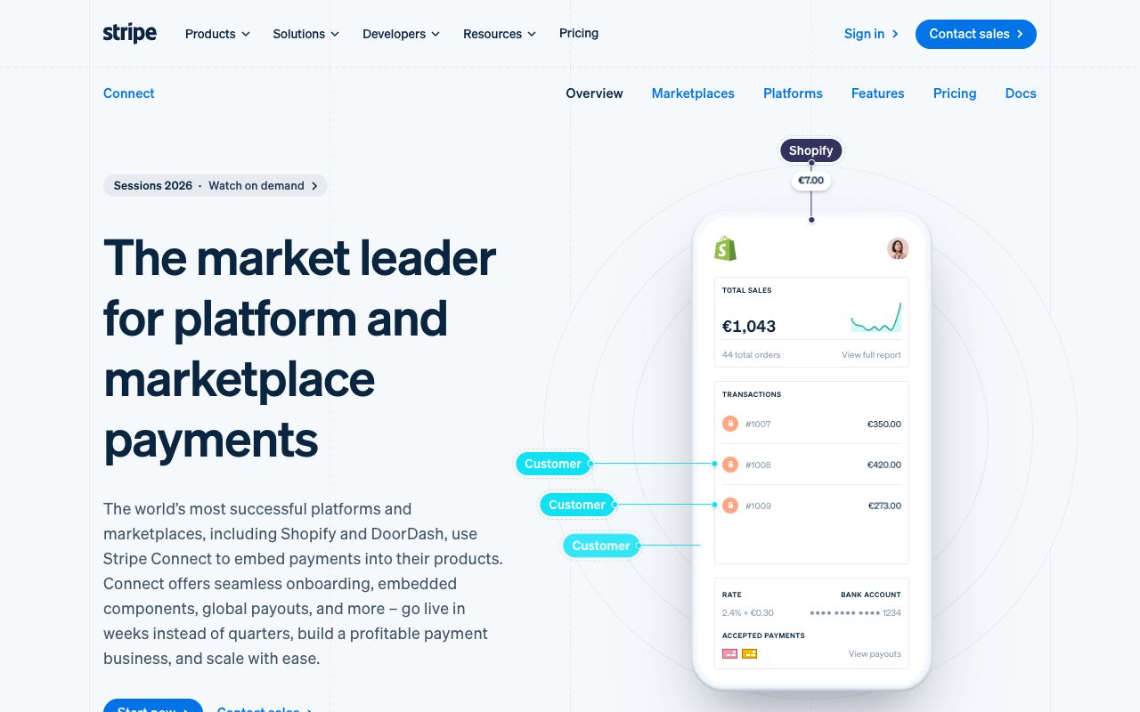
The page has been redesigned since. The 2017 cubes are gone, but the thinking is still visible: the dashed grid lines, the tilted colour band and the diagram-like product shots in these screenshots.
How it's built
The post walks through five pieces, each chosen to be the cheapest tool that could do the job.
  EFFECT                  TOOL                    WHY
  tilted stripes          CSS Grid + one rotate   no 1px gaps
  floating lit cubes      CSS 3D + rAF shading    only visible faces
  laptop, phone frames    pure CSS                under 1KB, sharp
  Express demo            Web Animations API      about 5KB in all
  start on scroll         IntersectionObserver    no scroll listeners
  old browsers            polyfills on demand     most users load none

  pick an animation tool, cheapest first:
  CSS transition --> CSS animation --> Web Animations API
--> requestAnimationFrame- Stripes on a grid. The header's coloured stripes used to be absolutely positioned, which caused
rounding gaps and long media queries. Now they are cells in a CSS grid, and the whole
.stripescontainer is transformed to get the tilt. - Cubes with fake light. Each cube is a DOM
templateturned 3D with transforms. ArequestAnimationFrameloop works out which faces are visible, how each is transformed, and how dark it should be, by shading faces as they move away from a light at the centre of the stage.requestIdleCallbackandbackface-visibilitykeep it cheap. - Web Animations for the demo. It has the performance of CSS keyframes with JavaScript control,
including native
cubic-beziereasing. - Polyfills only where needed. Scripts feature-test and insert polyfills on demand, marked non-async so they run in order. A fallback stylesheet is added only for browsers without Grid.
The mesh gradient. Stripe's homepage now leads with a moving ribbon of colour. Stripe hasn't
written about it, but Kevin Hufnagl reverse-engineered it in 2020: a tiny WebGL library Stripe calls
minigl, a Gradient class that holds the animation, four CSS variables for the colours, and a
scroll observer that switches the effect off when it is not in the viewport.
Design decisions

- Colour lives in one place. On the homepage, the gradient ribbon carries all the colour. The text, buttons and logos around it stay on white, so the gradient reads as the brand.
- Tilt as a signature. Below the Connect hero, a band of blue gradient crosses the page at an angle over the grid columns. The same tilted-stripe idea the 2017 post builds with CSS Grid is still the page's rhythm.
- Visuals that explain. The Connect hero joins Customer labels to transactions on a phone with thin lines, like a diagram. The 2017 Express demo did the same job in motion: it shows how the product works rather than decorating it.
- Animate only cheap properties. The post's rules: custom
cubic-beziercurves instead of the built-in ones, onlytransformandopacity, and in most cases under 500 milliseconds. - Respect reduced motion. When Reduce Motion is on, all decorative animations are disabled, using
a
@mediablock for the CSS animations and theMediaQueryListinterface for the JavaScript ones.

Steal this
- Choose the cheapest tool that works. Walk the ladder from CSS transition to
requestAnimationFrameand stop at the first step that can do the job. See Pick an ease for the curves. - Make a gradient the brand, and pause it off screen. One animated mesh gradient, colours in CSS variables, stopped when not visible. Try it in liquid-gradient and read Make colour look expensive.
- Start motion when it is seen. Use
IntersectionObserverto play a sequence once it is fully in view, then carry that care into moves between pages with Flip layouts and page transitions and page-transitions.
Sources
- Connect: behind the front-end experience, Benjamin De Cock, Stripe blog, 19 June 2017
- How to create the Stripe website gradient effect, Kevin Hufnagl, 22 July 2020 (a third-party reverse-engineering, not Stripe's own)
- stripe.com/connect, the live page
GitHub globe: live data as a WebGL scene
How GitHub drew a globe of real pull requests from about 12,000 instanced dots, hid its own performance shortcuts inside the design, and degraded gracefully on slow devices.
Linear: redesigning a dense dark UI
How Linear cut visual noise, rebuilt its themes in LCH from three inputs, and shipped a full UI redesign in about six weeks, from its own write-up.