[§] /docs/cases/linear-redesign
Linear: redesigning a dense dark UI
How Linear cut visual noise, rebuilt its themes in LCH from three inputs, and shipped a full UI redesign in about six weeks, from its own write-up.
TL;DR
- Themes went from 98 hand-set variables to three inputs (base colour, accent colour, contrast), generated in the LCH colour space.
- The redesign cut chrome: less blue in the neutrals, calmer sidebar, tabs and headers, and stronger contrast for content.
- It shipped in about six weeks through stress tests, a feature flag, a private beta and a gradual rollout.
What it is
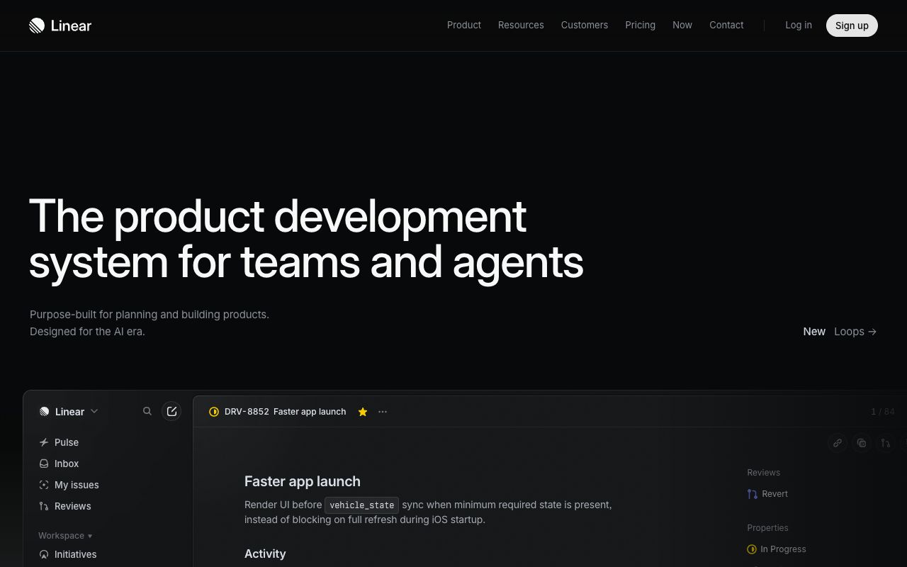
Linear is an issue tracker and product development tool, and it is known for a dark, precise interface. In March 2024 Linear published a two-part series on redesigning the app. Part two covers how they did it, "no infinite-loop processes, workshops, or sticky notes" involved.
The aim was to adjust the sidebar, tabs, headers and panels to "reduce visual noise, maintain visual alignment, and increase the hierarchy and density of navigation elements", so Linear could grow from an issue tracker into a system for product development.
How it's built
The redesign was a design system change more than a new layout. Co-founder Karri Saarinen explored concepts in Figma, mostly using opacities of black and white to set elevation and hierarchy. The team then rebuilt how themes are generated.
  BEFORE: 98 variables per theme, each set by hand

  AFTER:  3 inputs per theme
          base colour --+
          accent -------+--> LCH theme generator
          contrast -----+          |
                                   v
          surfaces: background, foreground, panels,
                    dialogs, modals
          text, icons, controls (aliases of core variables)

contrast 30 ... 100 --> high-contrast themes for free- LCH instead of HSL. In LCH, a red and a yellow at the same lightness look about equally light to the eye. HSL doesn't do that, so generated themes looked uneven. Custom themes already used an LCH generator for elevated and translucent surfaces; the redesign moved the main light and dark themes onto it as well.
- Contrast is an input. A contrast value controls how contrasty a theme is, so very high-contrast themes come out of the same system for people who need them.
- Type. Inter Display for headings, to add expression while staying readable, and regular Inter for everything else.
- Works everywhere. Linear runs in Electron on macOS and Windows and in any browser, so back and forward buttons, history and tabs had to be removable for the browser version.
Design decisions
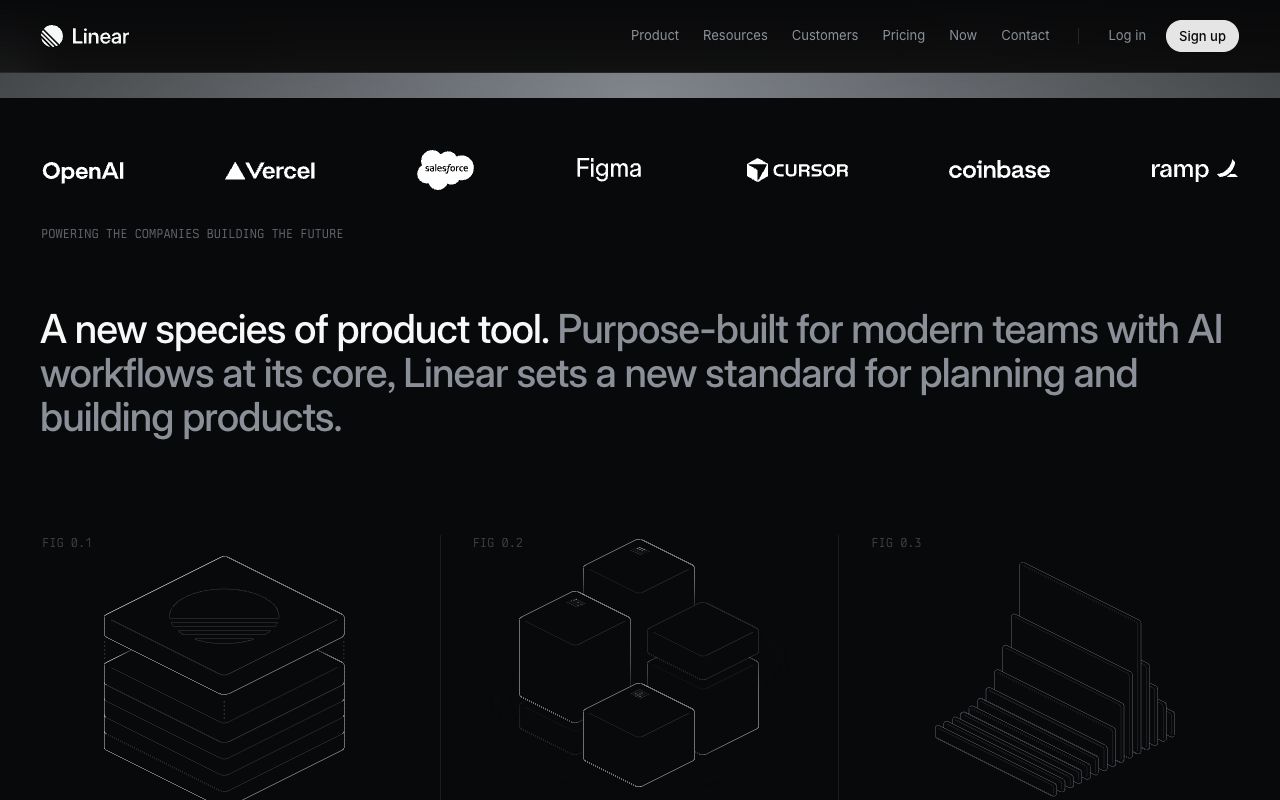
- Less chrome, more content. The team limited how much blue went into the colour calculations, to get back to "a more neutral and timeless appearance". On the marketing site, the same restraint shows: near-black ground, white type, grey secondary text and almost no accent colour.
- Hierarchy through brightness, not size. In the second shot the statement runs at one size, with the first sentence in white and the rest in grey. It is the black-and-white opacity method from the concept work, applied to type.
- Stronger contrast for content. Text and neutral icons got darker in light mode and lighter in dark mode, so content stands out from the chrome around it.
- Alignment you feel. Labels, icons and buttons in the sidebar and tabs were aligned both ways. The write-up says you won't see it at once, but you'll feel it after a few minutes.
- Scope held tight. Navigation problems were set aside because fixing them needed deep engineering work, so the project stayed a redesign. Stress tests across the main views came before any code.
- Ship fast behind a flag. A small dedicated team, a feature flag for staff, an internal toolbar toggle to compare old and new, then a private beta and a rollout to a share of workspaces each day.
Steal this
- Generate your theme from a few inputs. Pick a base, an accent and a contrast level, and derive every surface in a perceptual space like LCH or OKLCH. See Tokens and colour and Make colour look expensive.
- Use brightness steps for hierarchy. On a dark UI, white, grey and dim grey do more than extra font sizes or colours. Try it on a layout that moves, like flip-bento, and read Flip layouts and page transitions.
- Treat a redesign as a project with milestones. Stress-test the direction on your densest screens first, then ship behind a flag and roll out gradually.
Sources
- How we redesigned the Linear UI (part II), Linear, 28 March 2024
- A design reset (part I), Linear
- linear.app, the live site
Stripe Connect: motion that stays fast
Stripe's own write-up of its Connect page, with CSS Grid stripes, CSS 3D cubes, a 5KB Web Animations demo and polyfills only for those who need them, plus how its animated mesh gradient works.
Vercel Ship badge: a lanyard you can grab
How Vercel turned a conference ticket into a 3D badge on a physics rope, in about 80 lines of React Three Fiber.