[§] /docs/cases/balatro-deck
Balatro deck: cloning a look from its real assets
A slide deck built to look, move and sound exactly like the card game Balatro, by reading the real palette, shaders and timings from the game's own files instead of eyeballing screenshots.
TL;DR
- Every colour is an exact value from the game's code, and Tailwind's default palette is wiped so nothing else can leak in.
- The backgrounds are ports of the game's own swirl and paint shaders, running on one WebGL canvas for the whole talk.
- Motion ("juice") comes from one timing table read from the game's source, with a CRT effect kept barely there.
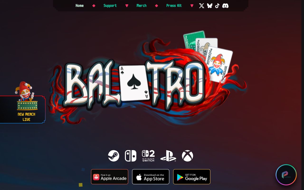
The reference, not the deck: the official Balatro site. The deck itself uses the game's own assets, so it isn't shown here.
What it is
A university presentation about the card game Balatro by LocalThunk, built as a web app. Slides look like the game's menus and run screens, buttons press like the game's buttons, and the soundtrack changes layer as the talk moves between sections. It was a non-commercial class project, labelled fan-made and unofficial, with a credits slide naming the studio, publisher and font author.
The method is the point: clone from the source's real materials, not from memory or screenshots. A screenshot gives you compressed colours, a scaled font and one frame of an animation. The real values were sitting in the game files all along.
How it's built
Stack: Vite, React 19, Motion, OGL for the shaders, Tailwind v4, and Playwright for visual checks.
Balatro is made with the LÖVE engine, so the game's Balatro.love file is a plain zip. From a copy he
owns, Bruno read the palette from globals.lua, the sprite sheet grid from game.lua, the shaders
from resources/shaders/ and the button timings from engine/ui.lua.
  Balatro.love (a zip, from your own copy)
     |
     +- globals.lua ------> tokens.css      every colour, nothing else
     +- game.lua ---------> sheets.ts       sprite grid, 71 x 95 cards
     +- splash.fs ----+
     +- background.fs +--> one OGL canvas   ported line by line
     +- engine/ui.lua ----> motion.ts       100ms hold, juice timings
     +- music1..5 --------> WebAudio        5 synced layers, gains only

  one canvas for the whole visit:
  slide sets a target look --> render loop eases uniforms (about 0.6s)
uMenu 1 = vortex ... 0 = in-run paint- Palette. Red
#fe5f55for MULT, blue#009dfffor CHIPS, all straight from the game's colour table.--color-*: initialwipes Tailwind's palette first. - Shaders. The React Bits
<Balatro />background was the starting point, but the finished deck runs ports of the game's ownsplash.fs(the menu vortex) andbackground.fs(the in-run paint). The ports keep the original constant names so a diff against the source stays readable. The program is never rebuilt on a slide change: the render loop eases every uniform toward the new target, so the vortex melts into the paint. - Pixel font. m6x11plus by Daniel Linssen, with font smoothing off and sizes only at multiples of its design size.
- Juice. One timing table drives both CSS and JS: a 60ms button press, a 100ms hold (the game's
own
G.TIMERS.REAL - 0.1), a 400ms decaying wobble on hover, and a 300ms ease-out counter roll.
Design decisions
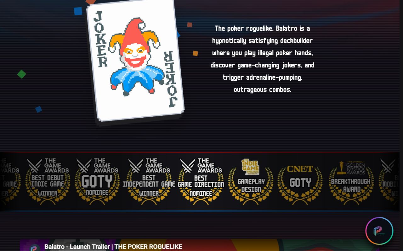
- Hard shadows, stepped corners. The game's buttons and cards drop onto a solid offset shadow, as
on the joker card above. The deck builds its buttons with a 20-point
clip-pathfor stepped corners, noborder-radius, and a face that drops 6px onto the shadow when pressed. - The CRT effect is barely there. Faint scanlines like the ones in the shot above: 2px lines at 4% opacity and one vignette. Enough to read as a screen, not enough to fight the text.
- One unit rules the layout. The spacing unit is 96px, a twentieth of the 1920 × 1080 stage. Layouts were measured from a real 1920 × 1080 capture of the game's menu.
- Progress in the game's language. Slides advance as blinds and antes, not page numbers, and the background shifts to the game state that fits each section, like boss red for the limits.
- Tuned for the room. On a projector the background looked frozen, so it runs at 2.5× speed with contrast raised to 1.35. Music sits at -18 dB and sound is off by default.
- Reduced motion slows, it doesn't stop. Under
prefers-reduced-motionthe swirl runs at a quarter speed, because a frozen swirl looks broken, and animated cards are parked in fixed spots.
Steal this
- Read the values, don't sample them. Open the source (a game file, a stylesheet, a token file) and copy exact colours and timings. Then wipe the defaults so only those exist. See Make colour look expensive.
- Keep one WebGL canvas and ease its uniforms. Changing a target and lerping toward it makes a shader its own transition. See it in liquid-gradient.
- Make the screen effect subtle. Scanlines, vignette and noise should be felt, not seen. Build the stack with Post-processing stack and compare with crt-signal-lost.
Sources
- Bruno's build notes, Design Cloning and Animation, written from the deck's repo on 14 September 2026 (private build notes, not public)
- playbalatro.com, the official Balatro site (the reference screenshots)
- React Bits Balatro background, the shader starting point
- m6x11 by Daniel Linssen, the pixel font
BR95: Windows 95 in the browser
How brunojaamaa.dev became a believable Windows 95 desktop with real bevels, pixel fonts, a window manager, stepped motion and dithered art, while every window stays a crawlable page.
GitHub globe: live data as a WebGL scene
How GitHub drew a globe of real pull requests from about 12,000 instanced dots, hid its own performance shortcuts inside the design, and degraded gracefully on slow devices.